If there’s one thing designers love, it’s fonts. We’re obsessed with them. Finding the perfect typeface can be the most challenging part of a project. There are serif and sans serif fonts (serifs are the “feet” at the bottom of the characters in some fonts.) Each has its place in design. And, with thousands of each out there, there’s an endless supply to choose from. But when you do find the perfect font, it’s oh so sweet.
Here are some of our favorite typefaces that we keep going back to – maybe you’ll pick up a new favorite too!
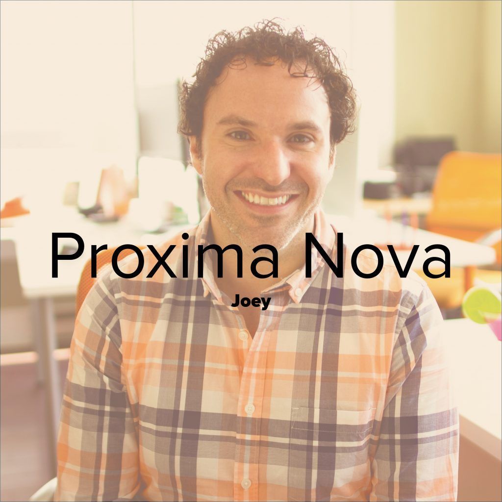
“My favorite is Proxima Nova! It’s a super versatile sans serif font. It is clean and simple but has just enough character.”

“I love Aaux Next because it’s modern yet friendly and approachable – look at that happy little lowercase ‘a’!”
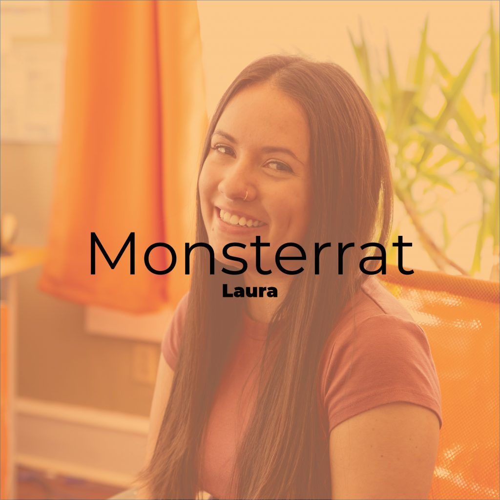
“I love Montserrat. It’s available as a Google font so it works great for all your design needs, including web design. All the weights and cleanness of the font make it great for both headlines and body text – it’s my favorite go-to font. It’s saved my life many times!”

“Oswald has been a tried and true sans-serif for me for years. It’s versatile, visually pleasing, and the elongation and condensed nature of it always not only commands attention, but also is great for readability/hierarchy when used with other complimentary typefaces like Montserrat, Open Sans, or another battle-tested crowd pleaser like Proxima Nova.”

“I love Futura because it’s clean and geometrically pleasing. It also feels timeless to me, somehow managing to be both modern and vintage at once.”

“I keep finding myself leaning towards Trade Gothic. Honestly, one of my professors recommended Trade Gothic in college and I’ve been using it ever since. It always works with whatever type of project I’m working on, so I just keep going back to it!”