How to know if you’re ready to break up with your old logo
So you’re tired of your same old worn-out logo. Maybe you’re ready to take out a personal ad in the newspaper, looking for a new logo that likes piña coladas and getting caught in the rain. OR, you can walk through this set of questions first to determine if a rebrand is right for you.
Can someone easily recognize my brand?
If your logo is the one thing building recognition with your audience, you may not be ready to rebrand. Consider a slight refresh (swap a font, simplify some lines) that helps evolve your brand without hurting recognition. Don’t throw out the baby with the bathwater!

Instead of committing to a full rebrand, we refreshed Alliance Wealth Advisors‘ logo with additional color and a modern font. This helped push their current brand forward while staying recognizable to the active audience that they have built up over the years.

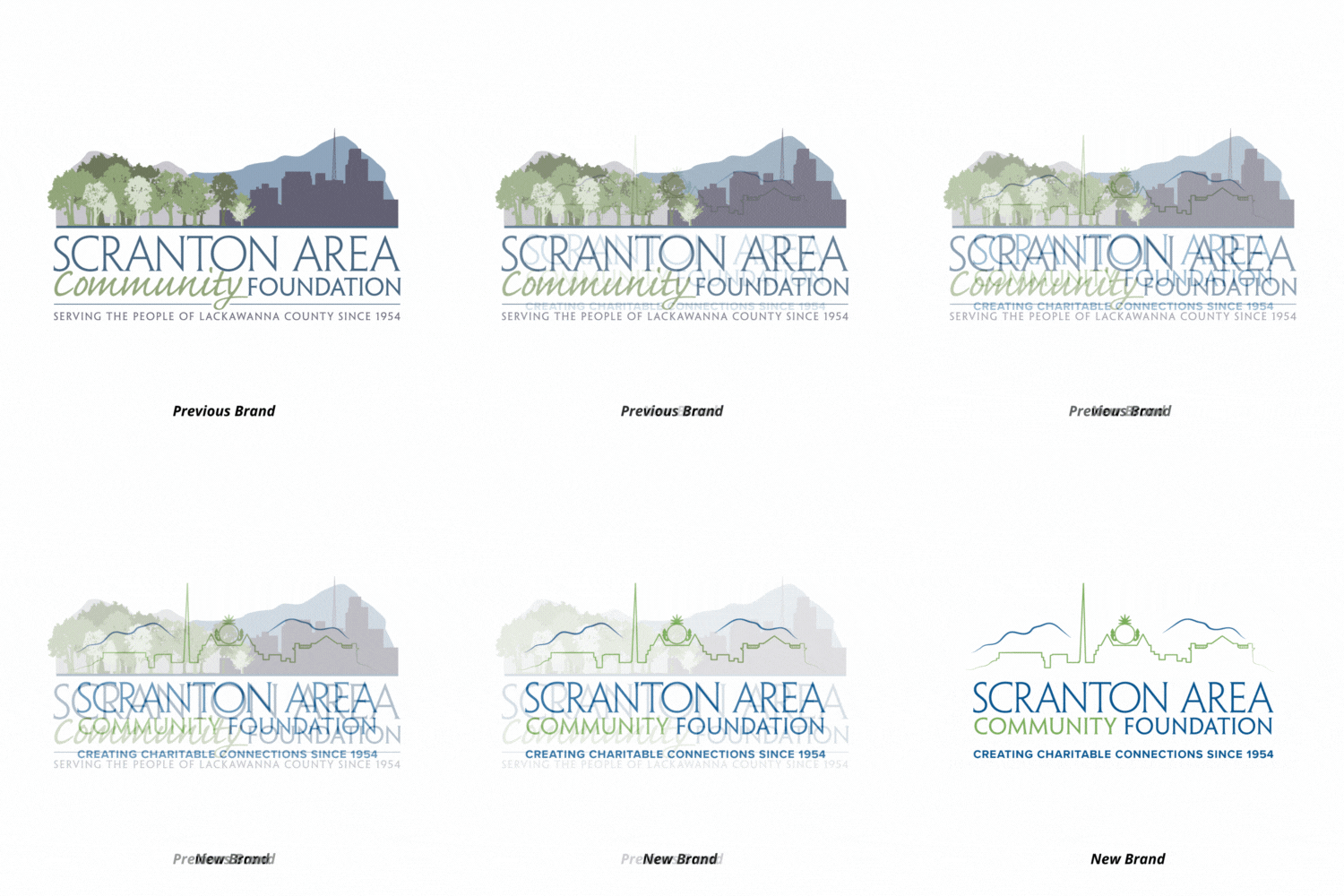
Our friends at the Scranton Area Community Foundation wanted to refine their logo while staying within the boundaries of their preexisting brand. We simplified their iconic Scranton skyline but kept the colors and font that many people already associated with their logo.
Does my brand come across as “dated”?
No one likes a brand that feels outdated and out-of-touch. If your logo is too much of an 80s throwback or maybe feels 1990’s-Microsoft-clipart, it may be time to take the leap. A rebrand is your chance to bring in fresh fonts, colors, and graphic styles that are more timeless and flexible.

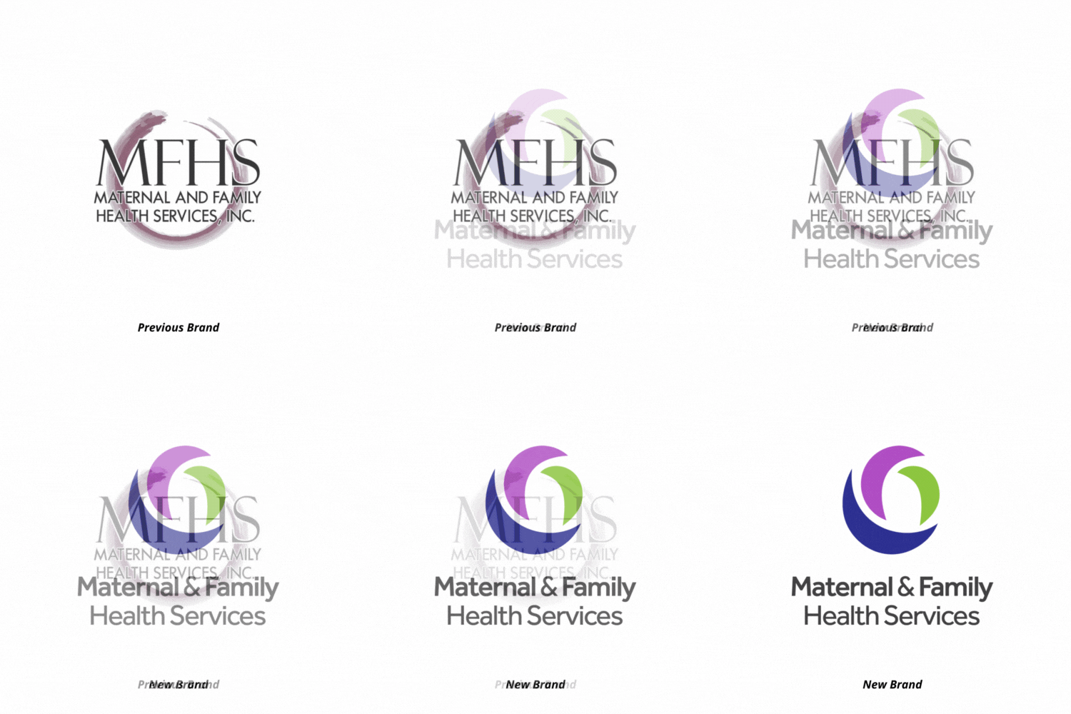
The swoop in the old Maternal and Family Health Services logo seemed a bit dull and outdated compared to the wide variety of advanced services they now offer throughout the region. We introduced a clean new font and bold, bright colors for a modern and welcoming logo update to reinforce MFHS’s role as a community health care provider.
How has my business changed since this logo was made?
Once we find our footing in the industry, we may adjust our business model to excel where our strengths lie. Your business may look dramatically different from where you were when this logo was created (or even a little different). Consider an update that can reflect your new service offerings, products, or mission.

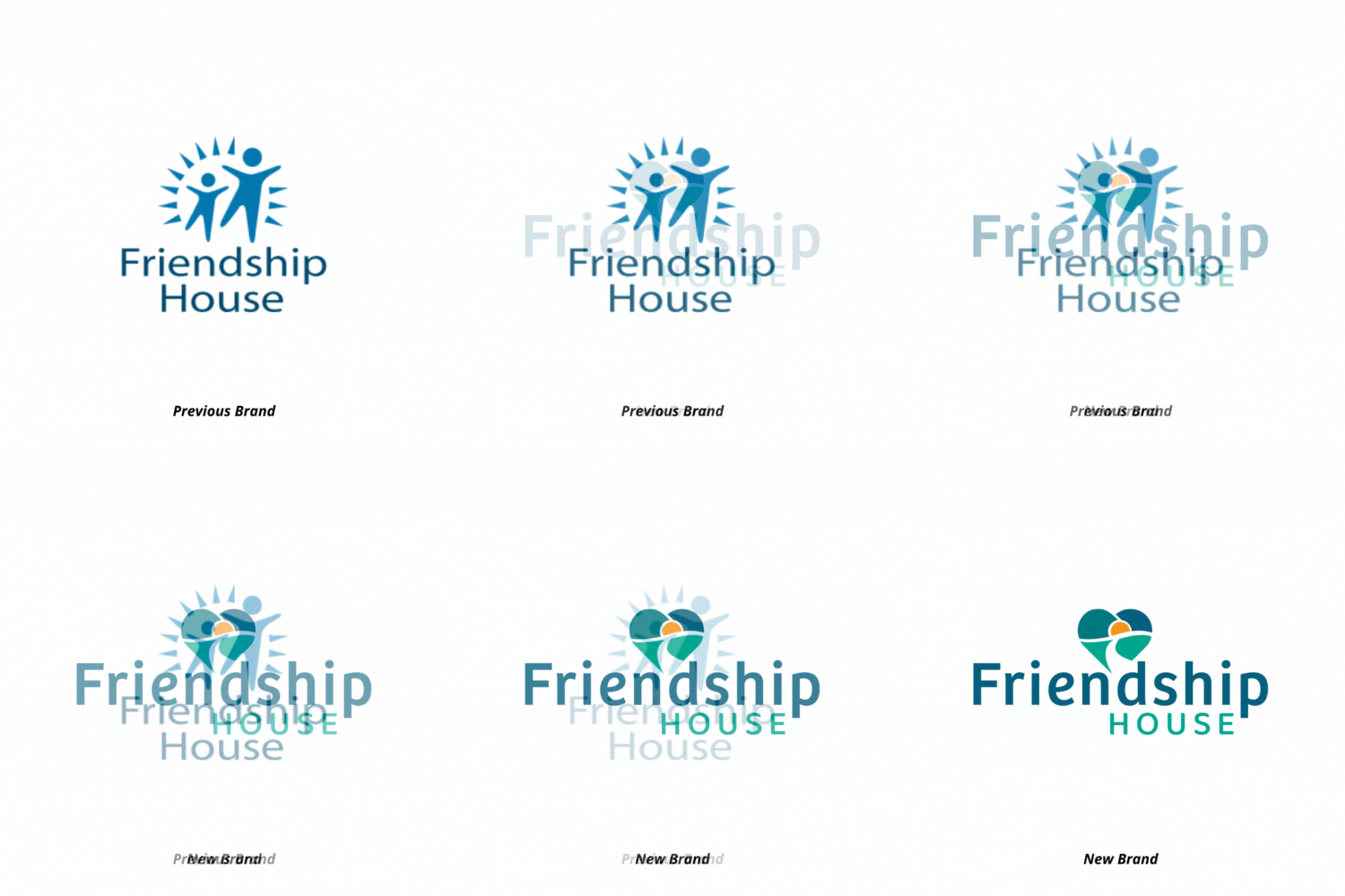
Our friends at Friendship House have been expanding their services and locations. Their new logo is a friendly reflection of the growth they have experienced as they meet the needs of new audiences across the region.
Am I ready to invest in the cost of updating all my branded business assets?
Street signage, business cards, letterhead and envelopes, embroidered shirts, and more – where does your current logo live and what would it cost to update it in all those places? If this is an investment that isn’t quite in your budget, maybe hold off on that rebrand a little longer while you set aside funds for these updates.

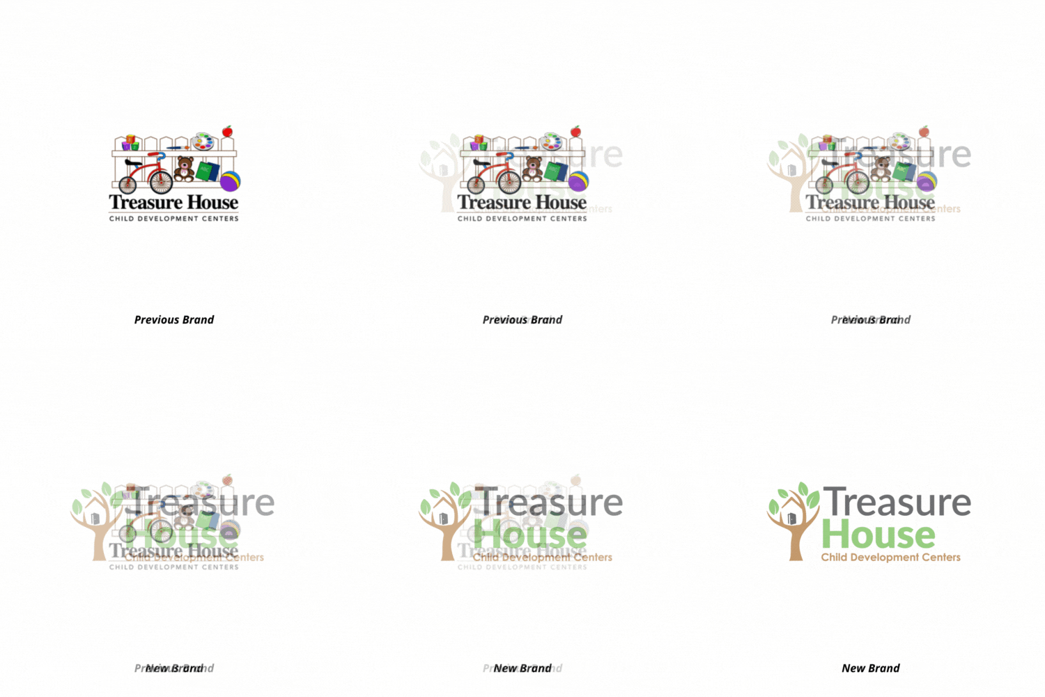
With 6 locations and numerous staff members, new signage and an abundance of t-shirts are almost certainly in the works after Treasure House Child Development Centers rebranded. This new logo has helped them streamline across all locations while taking on a cleaner look.
Is a rebrand in your future? Let’s weigh the pro’s and con’s together to determine if it’s time for a small update or a full rebrand. We can help make the breakup with your old logo a lot less painful (we also make better piña coladas.)