So you’ve heard the term user experience (UX) here and there, maybe while streaming the most recent Apple product release presentation. Maybe you’ve heard about the slick new “UX” on the latest Android device. But what do people really mean when they talk about UX and how does it impact you as a human living your life in the year 2020?
Let’s start with the user: YOU.
Whether you’re experiencing a music app, your online banking website, a set of IKEA directions, or the TSA line at Philly International Airport (I’m so sorry if that’s the case) – your daily activities are packed with a variety of different user experiences.
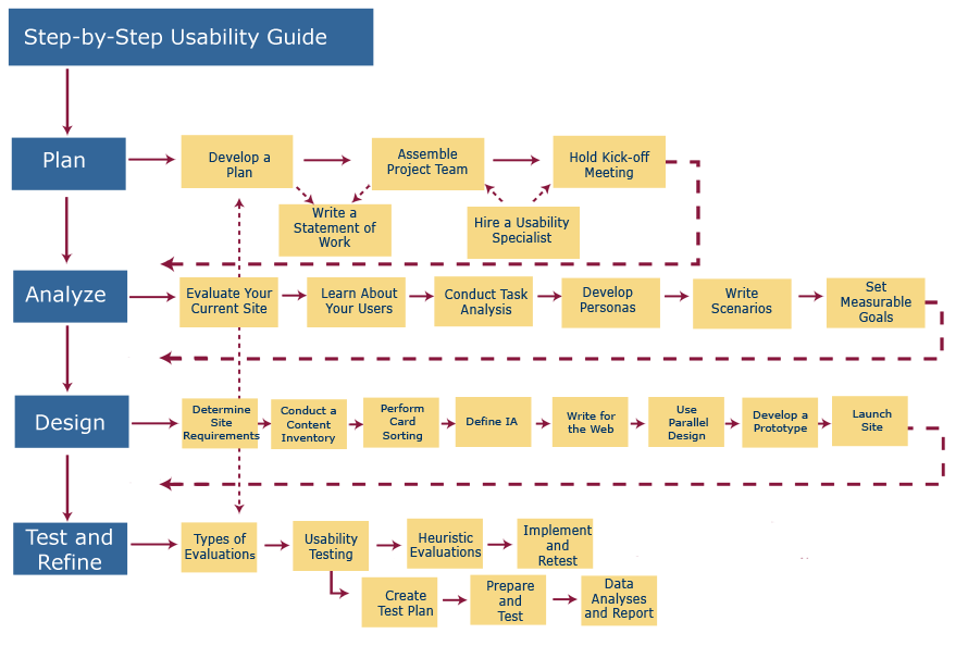
According to usability.gov, an excellent authority on user-centered design standards, “User experience (UX) focuses on having a deep understanding of users, what they need, what they value, their abilities, and also their limitations.” This means that in order to create a successful experience, I need to design with the end user in mind at every step of the website process. From research and design, to development and testing, I am always thinking of how the person on the other end of that “Learn More” button is going to interact with it (and then I’m testing the s*** out of it).
The interesting phenomenon with UX that many designers have found to be true is that we tend to notice UX the most when we’re having a negative user experience. Much like that one guy on Yelp who had the “worst pizza of his life” in your beloved local pizzeria, you declare that this is “the worst website/app/platform I’ve ever used” and vow never to return again. Likely, many other users have felt the same way.
How does this happen?
Our pals at usability.gov helped shed some light on this with the key areas of successful UX:
- Intuitive design: a nearly effortless understanding of the architecture and navigation of the site
- Ease of learning: a user who has never seen the user interface before can easily accomplish basic tasks
- Efficiency of use: an experienced user can accomplish tasks quickly
- Memorability: after using the system, a user can remember enough to use it effectively in future visits
- Error frequency and severity: if users make errors while using the system, how serious are the errors and how easily do they recover from the errors
- Subjective satisfaction: If the user simply enjoys using the system
Essentially, when we have a successful positive user experience, we don’t immediately notice because the design of the experience is unobtrusive and becomes second nature. Think about the last time you went to the grocery store. Did you know where to find a cart? Of course, it’s always near the front with the big bunches of apples and bananas front and center. Were you able to use the self-checkout seamlessly? It yelled at you 5 times to put your item back in the bag? Ok, we’re still working on that one…
Bad user experiences happen when we don’t focus on the human user that will be engaging with the end product on a daily basis. Designers and developers combat this by:
- Creating “user personas” in the initial research phase that represented the intended audience and help build that element of human empathy in the early stages of design and feature development
- Designing and developing with usability standards in mind like those set forth by usability.gov
- Testing (and testing and testing) on ourselves and other real humans to analyze these interactions with the product so we can find and address any areas of confusion or frustration
By using these combined methods, ideally we will avoid any negative user experiences and have a clean, user-centered design as our final product (website or otherwise). If we’re not successful with a website’s UX, we’ll know – Google Analytics metrics don’t lie. High bounce rate on a certain page is usually a pretty good indicator that something is wrong with your UX.
So next time you scroll through a website and get stuck on a certain spot, or the next time you have a bad experience with a checkout – maybe let someone know. The designer on the other end might need a reminder that you’re human after all. 😉

