A behind-the-screen look at how a logo transforms into a motion graphic to embody your brand and captivate viewers.
Logos are everywhere. They’re in your face, all the time. They’re on the devices you use, on the clothes you wear, on the buildings you pass outside, and sprinkled heavily throughout all the content you consume. Logos and branding have become so embedded in the fabric of our culture that we often don’t even notice the small insignia on the bottom of our socks, the teeny-tiny text under the title of a click-bait listicle that says “Content Sponsored By BRAND XYZ,” or the semi-transparent watermark in the corner of an ad during the morning news.

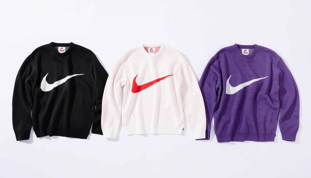
Or – we make sure people notice our logos. We wear Gucci belts with the iconic interlocking G’s on the buckle. Apple stickers proudly displayed on our bumpers and laptop cases to proclaim “yes, I do in fact own several Apple devices that all sync to iCloud and I live-tweeted the last Keynote presentation.” Even Starbucks’ annual holiday coffee cups are gripped by coeds in plaid scarves throughout the college campus. This sort of instant recognition and passionate identification with a brand is often the goal, and a main reason why logos saturate our lives. They strive to become so ubiquitous (but also still cool enough) that people want to brand themselves as a way of saying “Nike is cool and I’m cool too because I like Nike.”
Over the years, the way I look at logos has changed. To me, they’re not background noise, nor are they a status symbol. Notice where these logos are placed and think about the intention behind that placement. Look at the curves and the shapes created by the wordmark, and the way the letters fit together. Pay attention to the use of color and think about what that brand is trying to make you feel without having to say it overtly. Is this shade of green supposed to convey that they’re environmentally-friendly or that they offer some sort of financial service? I look at the symbol or icon, if there is one, and I start to imagine ways that I might make it move.
I pay attention to the use of color and think about what that brand is trying to make me feel without having to say it overtly.
In our ever-increasingly digital world, movement as a part of brand identity should be a main consideration from the beginning. Granted, some logos lend themselves to motion better than others, but every logo has the potential to move in a way that enhances the viewer’s impression of the brand and sticks in their memory.
This timelapse shows an example of my process of taking a logo from flat to fully animated.
- I start by breaking the logo into pieces – words, symbols, more words.
- If there are multiple words, should they come in together or separately? Does the text write on? Does it fly in from somewhere unseen?
- Is there a symbol or an icon? What kind of movement can that symbol do? Does it have a personality? What does the symbol represent and how can I convey that in the way I make it move?
- If there is a tagline, how should that move in relation to the rest?
- Is the movement more mechanical or organic?
- Are there any extra effects that make would add to the viewer’s experience?
Motion requires more attention than adding a few PowerPoint transitions. With a well-crafted animated version of your logo, you’ll see results and recognition across the numerous video-centric channels available today.
Now get that logo moving!
